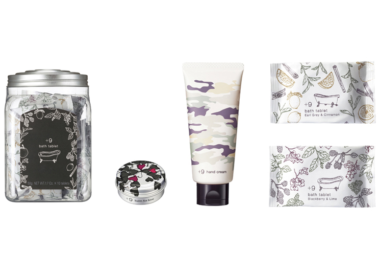
+9(add ninth) is a type of brand that is completely new among POLA’s lineup. The concept around which the brand was designed was to create products that customers at POLA beauty salons can buy casually after treatment sessions.
In the core of the brand design were the four symbols: ♪ ♡ (・。・)! (*´∇`).These represent what we as vendors consider as “ideal mental states of buyers” toward our products after being surrounded by other POLA products; i.e., first impression; upon listening to product description; when actually using the products; after using the products.
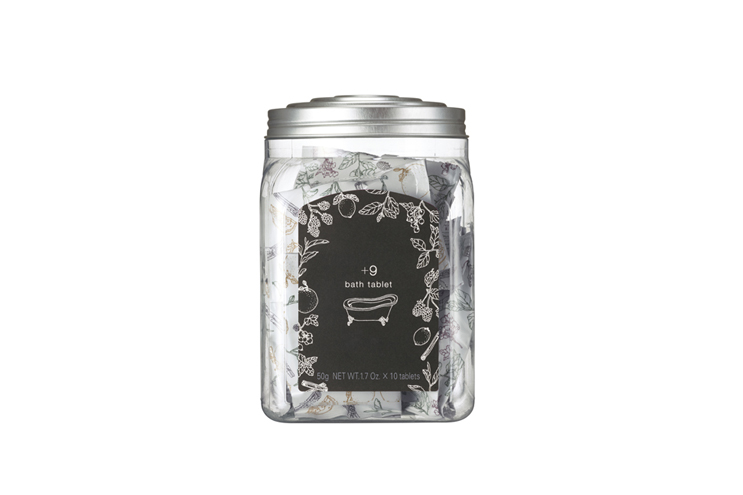
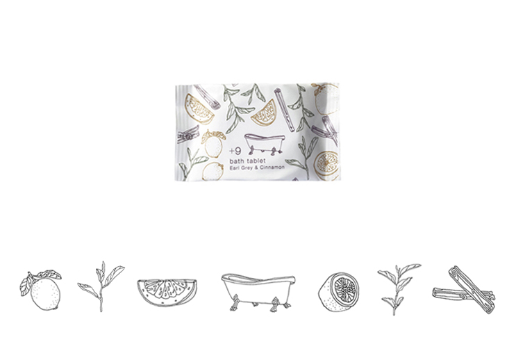
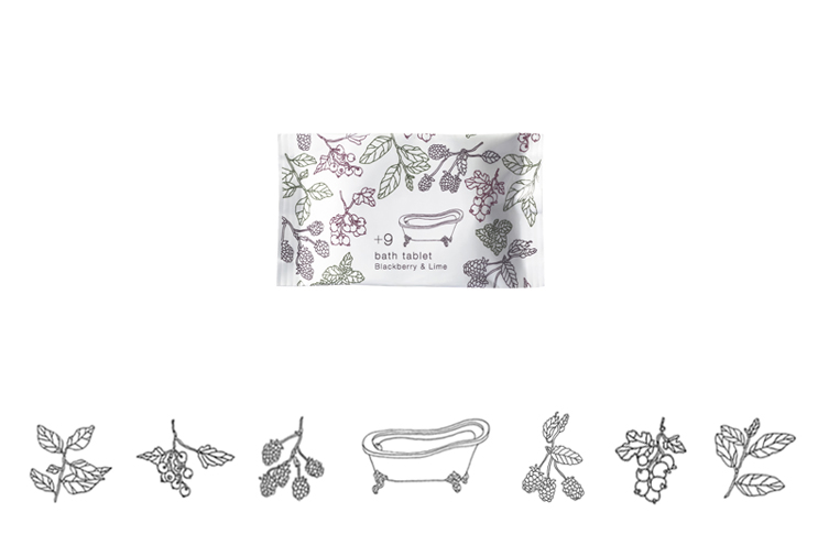
We developed the products in workshop style so we did no more than direct the project while the actual designing was left to POLA’s in-house designers. We asked Ryu Itadani, an artist currently based in Berlin, to do the illustration on the bath salts packaging. At each step of the development, we referred back to the four symbols above and we feel that we managed to come up with a group of products that stay loyal to the “ideal mental states of buyers”.
+9(add ninth) is a type of brand that is completely new among POLA’s lineup.
I took part as an art director, in the project to create products that customers at POLA beauty salons can buy casually after treatment sessions.
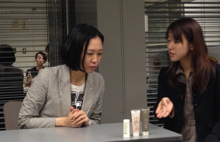
With members from product planning department, PR department and design department of POLA, we worked in workshop style to elaborate the brand name, it’s direction, the products and their features and their packaging designs.
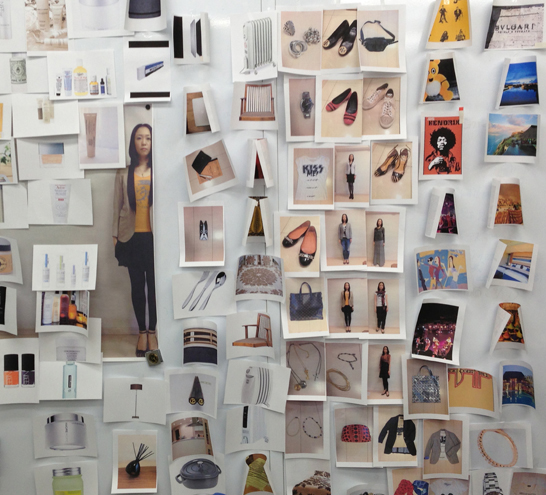
We started out by asking the brand manager, Ms. Yamaguchi, to act as our target customer. In order for all the project members to share the life of the target customer, we inquired about her likes and dislikes and then we all descended on her home.
Next, I had all the project members undergo POLA beauty treatments so that they could experience the psychological and physical state of “having undergone the POLA beauty treatments sessions” which our consumers will be in. With the product ideas the members came up with, we did sales role plays to see if they were marketable. Experiencing every aspect of the brand was a key to its development.
Nowadays most projects are developed through exchanges of paper documents or emails but with this project all the members took part in physically experiencing the brand which in turn helped us make decisions. This may seem like an inefficient way of working but the pace of development is no slower than other prevalent type of projects. Everyone is on the same wavelength as sharing of physical experience makes communications between the members smooth.
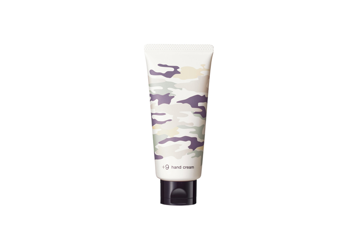
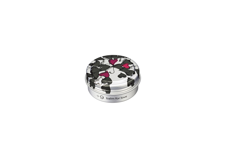
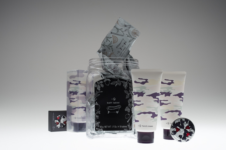
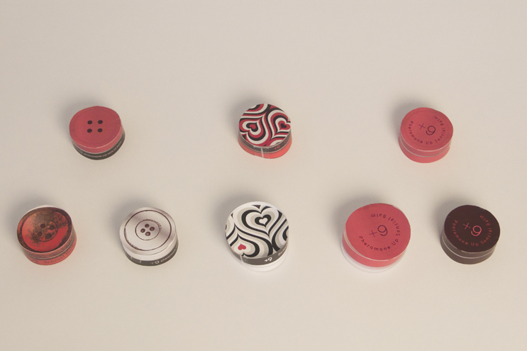
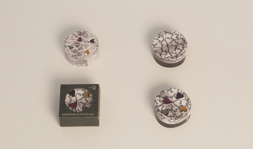
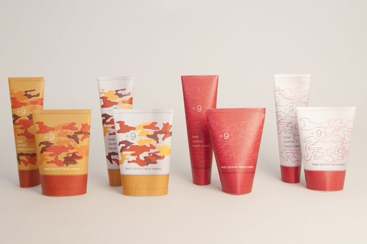
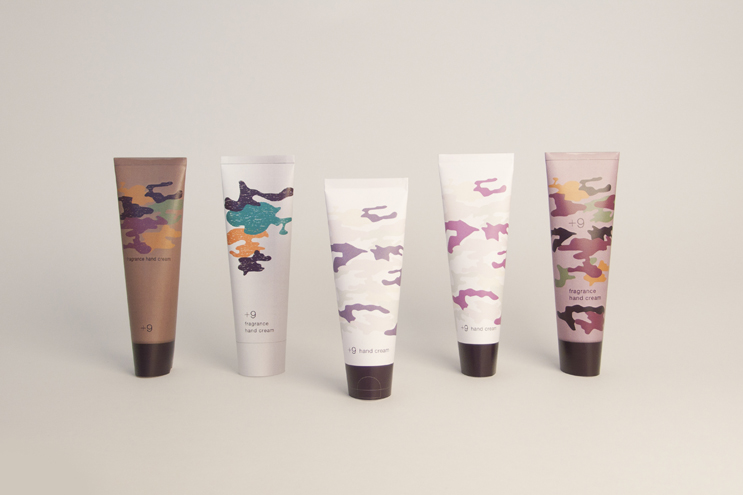
The first products to go on sale are hand cream, balm and bath salts. They are designed to appeal instinctively as “oh, what is that cute thing!?” to minds that are fuzzy and relaxed after undergoing beauty treatments. We asked Ryu Itadani, an artist currently based in Berlin, to do the illustration on the bath salts packaging. Illustrations for the other two products are done by designers at POLA design department. We emphasize the diversity and playfulness of the brand rather than its consistency by letting design convey uniqueness of each product. There is a loose continuity between the products as a brand that only becomes noticeable when they are seen side by side. One of the reasons I chose hands-on style development for this brand is because each project member’s sensitivity makes a big difference in controlling a brand in this way.
In general, design workshop has little to do with developing actual products. And because of that whatever you learn there often cannot be applied to actual business and workshop experience is nothing more than a temporary event. Workshop style product development lets you learn new development methods while being involved in actual business so it is very useful in developing new types of products or in reviewing product development methods that have become rigid.