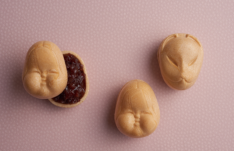
We have designed “Monaka (Sweet bean jam sandwiched by thin crisp wafers)”.
The face of “Okame” on one side comes from the name of the client’s shop while the face of fox on the flip side comes from a shrine of Toyokawa Inari which is to be found at their main shop. Rounded protrusions that are “Okame’s” cheeks on the front side are in turn fox’s ears on the back side. We had a Noh mask artist, Ms. Mitsue Nakamura, carve a model from which we created a smaller model using a 3D scanner and a 3D printer. Then we created a brass die from the smaller model. We had the brass die finished at a Kawasaki motorbike engine factory to preserve the finest details of the original model.
The skin of “monaka” is made by Tanekame, a long-established specialty shop. Grooves on the faces are due to their long-established method; they may make them look less pretty but they help spread the tasty aroma.
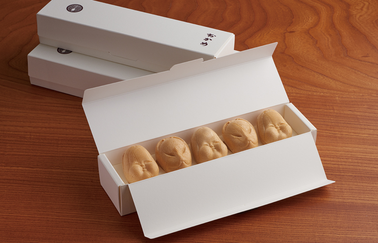
This packaging for 5 pieces of “monaka”, decorated with traditional Japanese sharkskin patterns, was specifically designed so that all the pieces in the box will stay facing upward. The client known for their “ohagi (Japanese sweet made with sweet rice and red bean cake) was looking to add an item to their menu that stays fresh for longer than a day. This project was planned and designed with the contrast between “ohagi” which is quite large and “monaka” which is quite small in mind.
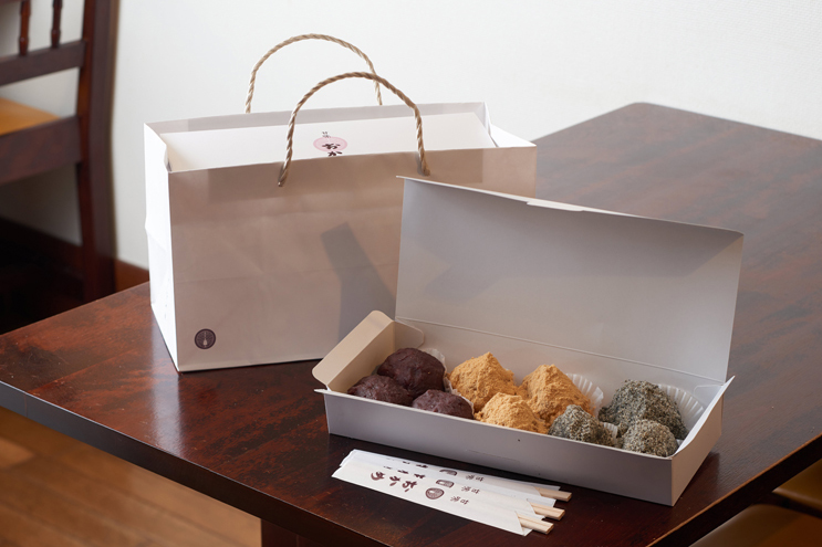
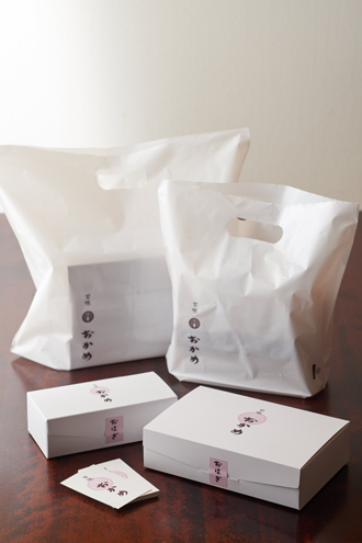
We designed gift packaging, shopping bag, business card and shop curtain for “Kanmi Okame”, Japanese style cafe which was founded in 1947 and has three branches in Tokyo.
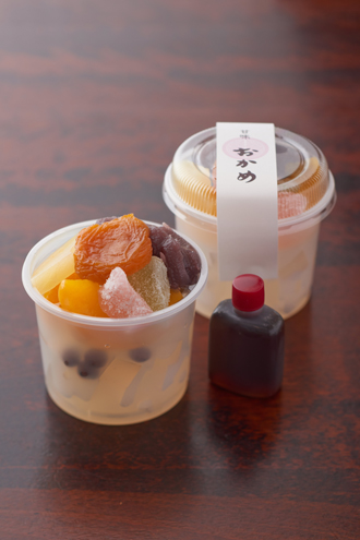
Ohagi (Japanese sweet made with sweet rice and red bean paste) and Anmitsu (Japanese sweet made of jelly, red bean paste and fruits) can be taken home. With ohagi, the most popular item on the menu which some call Okame’s signature dish, each piece is made with hands after and order comes in so customers usually need to wait for a while before they receive what they have ordered.
While we had to make sure there was some formality to the design of the packaging as many people buy these sweets as gifts, we had also been asked to simplify the wrapping process as much as possible so we came up with a paper box that called for neither wrapping paper or a tying rope.
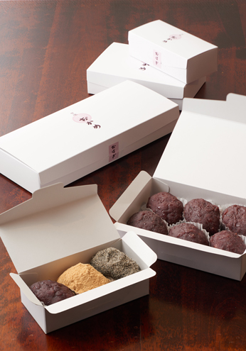
Moreover, ohagis themselves are quite inexpensive so the added cost of packaging had to be kept as low as possible. The solution was to minimize the range of sizes of boxes and bags after taking into consideration all the possible combinations of the sweets that go into them. This makes it possible to lower the cost of each box and bag as we can order them by bulk. Also we can avoid being stuck with excess stock of boxes or bags that are used infrequently.
A single partition board makes it possible to fit up to ten ohagis neatly in three differently sized boxes. The partition boards are made from leftover pieces of paper from the box making process so there is no cost. The partition board makes sure the moist and soft ohagis don’t stick to each other and keep the differently flavored sweets apart.
The graphics is a composite of the client’s family crest,”daki-myoga”(two Japanese ginger shoot)”, the logo for “Okame” that has been used for generations and a restored version of old characters for “Kanmi(sweetness)”.
“Ohagi is for ordinary people. There is no need for extravagant packaging for simple, traditional sweets. Novel packaging may put off our patrons who range from the elderly to young students which we would like to avoid” was the message from our client. With that in our minds, we came up with the unpretentious design that would not get in the way of the simple tastes that have been nurtured by family members as part of the family business for generations.
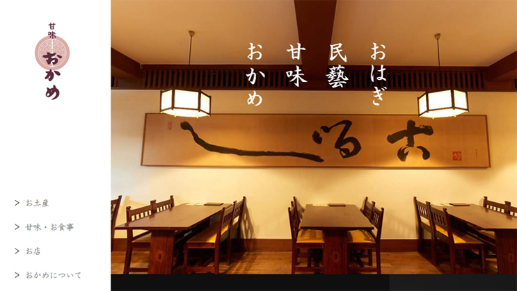
After designing gift packaging, etc. for Kanmi Okame, we designed their website as well.
Our emphasis was on presenting the products such as their signature dish, ohagi, as well as introducing the interior of their shops designed in the traditional folk craft style that they had inherited from their forebears. We wanted to introduce Okame to those who like folk craft but were not interested in sweets and had not come across with the brand yet.
The website is made of a single page and there is also a smartphone version to accommodate the needs of its users while it retains the classic and unassuming style that matches the atmosphere of the shops.